Project Euler
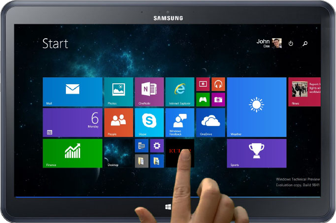
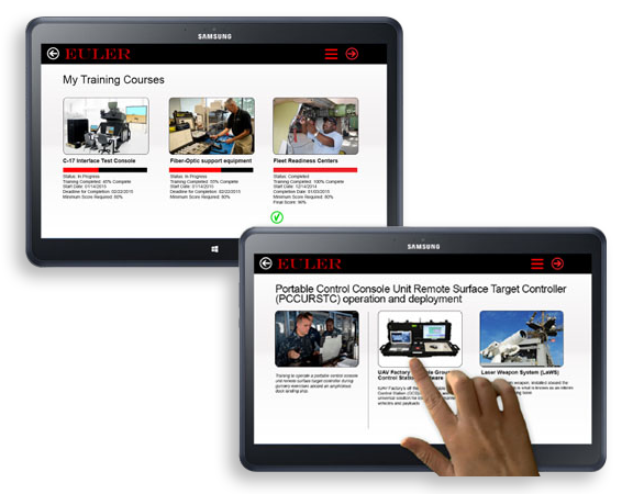
The client's concept was to create an app for potential military use, utilizing off-the-shelf technical and GPS software.
Potentially, this marriage of technologies would enable a Navy crew member, anywhere in the world, to use a mobile-device camera to snap an image of a piece of hardware and, using optical recognition, retrieve technical data on the fly. Additionally, the Administrator of the app could load it with training modules specific to the User's skill sets.
Truly a cool concept, and as we worked toward the look and functions of the UI, the brand identity was being fast-tracked in parallel to shorten time to market. Unfortunately, the names and color choices kept changing, so to keep the app moving forward, it was given a general-project name: Euler.
In the end, it turned out the reach of the technical necessities were ultimately beyond the client's grasp. Nonetheless, I'll share with you the mock-ups and identities created.
Logo Variations
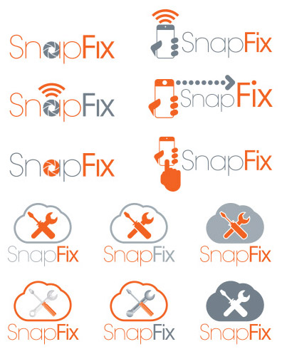
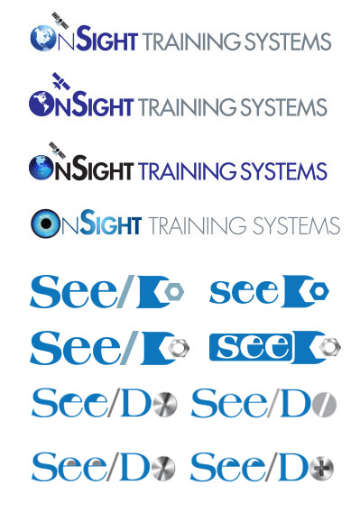
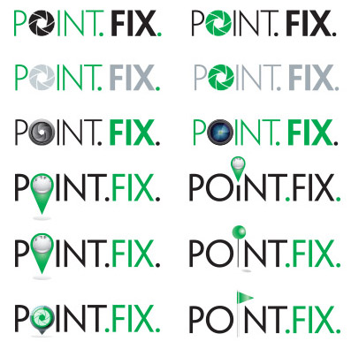
These are just some of the name and logo choices created for Project Euler.
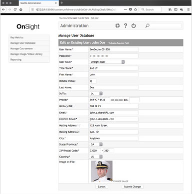
Administration
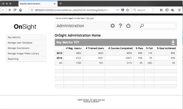
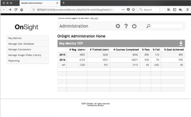
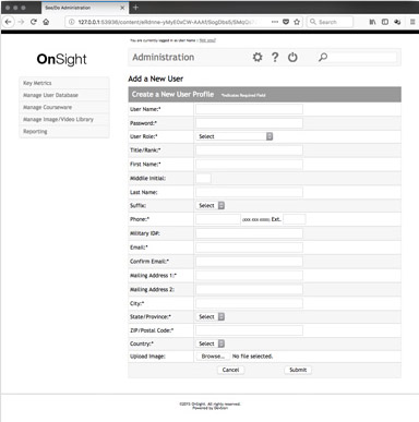
The Administrator website was originally built using the color palette created to support the brand. However, after several name and color palette changes, it was decided to use "placeholder tones" that would later be replaced once a name and identity had been settled upon. Additionally, the Administrator website never made it beyond HTML. You are welcome to take a look (the site will open in a new window), but keep in mind it is only unplumbed hypertext markup. Through the site, the Admin would have total control over the app—the ability to add, manage and delete Users as well as add, manage and delete training modules. Lastly, a robust reporting section would have provided Admin of the app real-time stats on courses taken and individual scores.
